



Elifelet

Elifelet

Cheese, skulls and everything in between.

A fictional heavy-metal pizzeria where pizza culture meets underground music.

Elifelet is a fictional pizzeria built around the collision between two cultures: greasy late-night pizza and heavy-metal imagery.

Brand Identity · Illustration · Packaging

Shenkar · Mentored by Dekel Maimon

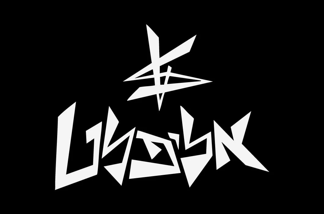
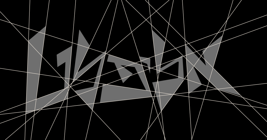
The logo
The logo
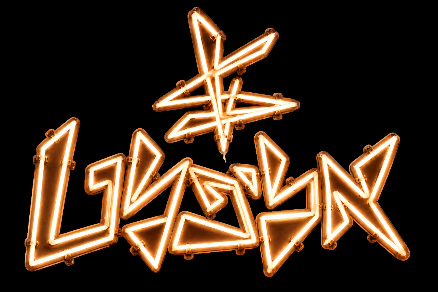
Elifelet in neon
Neon sign
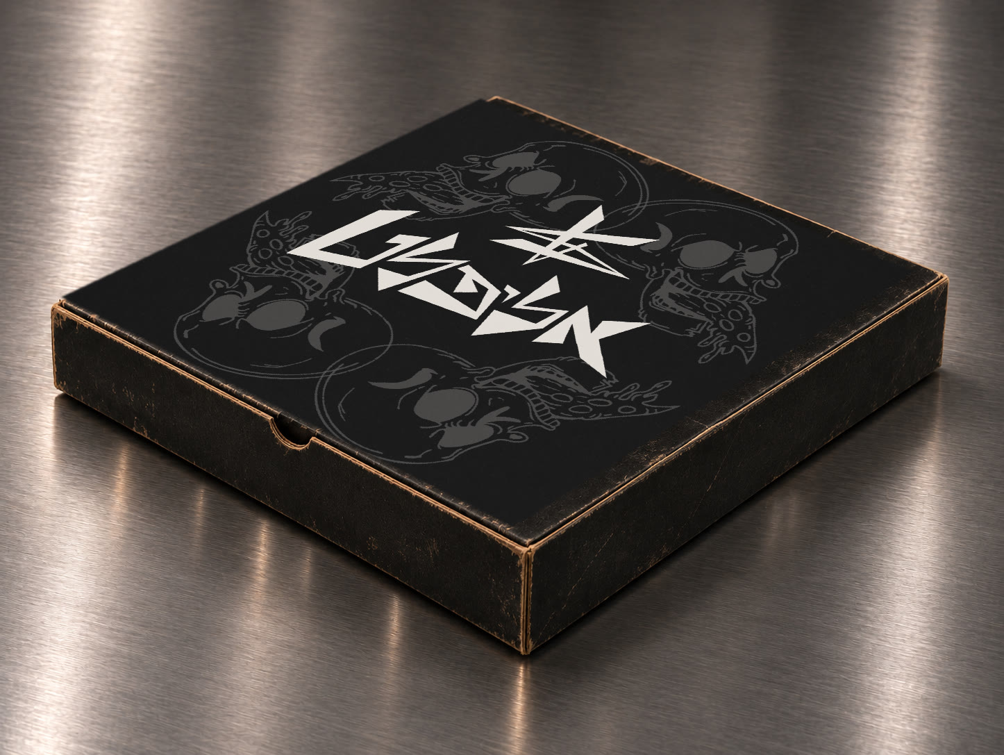
The box, four skulls
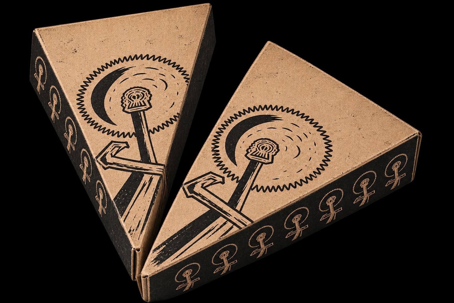
Slice boxes, printed
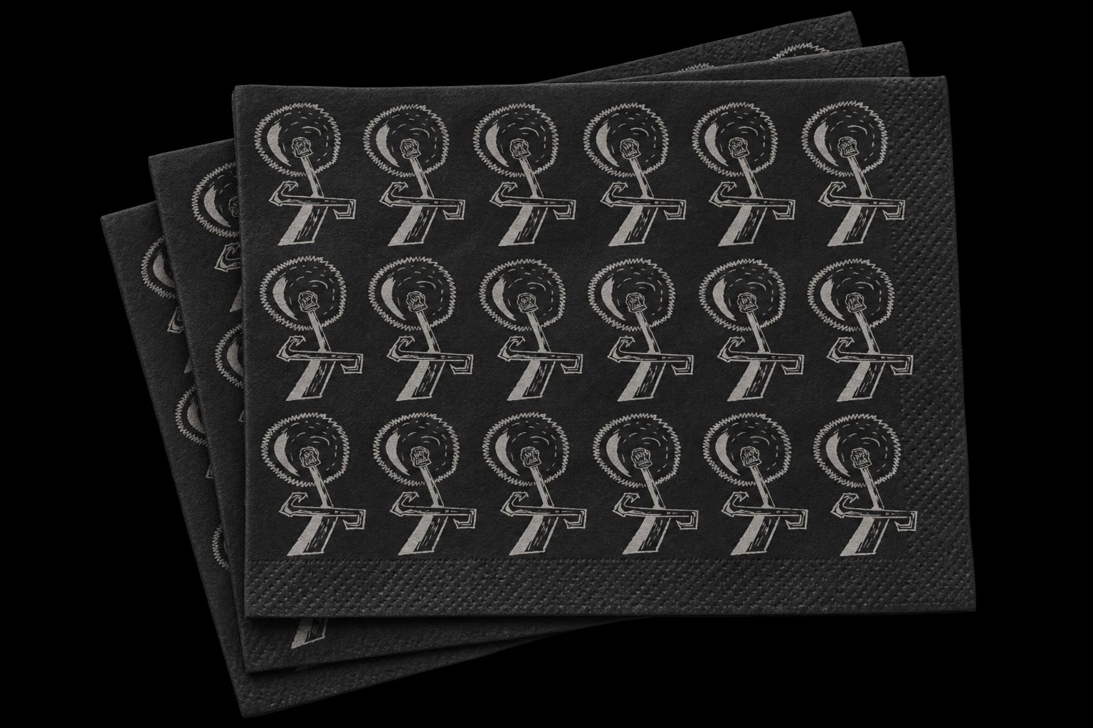
Napkins
Napkins
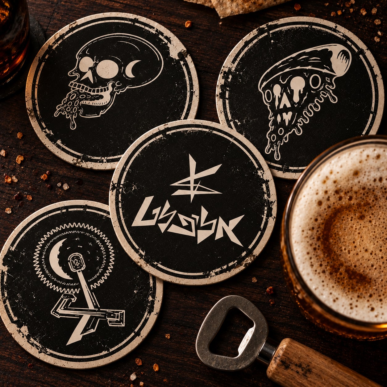
Coasters
Coasters
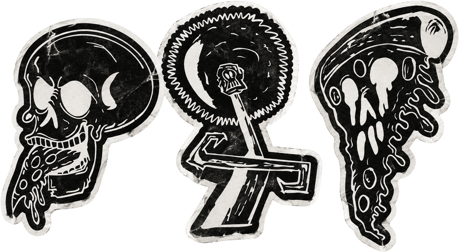
Stickers
Stickers
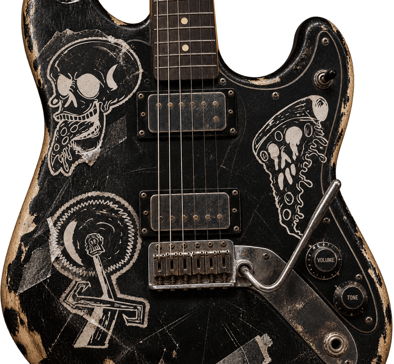
Stickers on a guitar
9:41
Open till 03:00
Hungry after
the show?
Cheese, skulls
and everything
in between

Two slices and a beer, every night after ten.

Popular pies
The Slice
Tomato, mozzarella
₪52
Skull Eater
Pepperoni, chili
₪58
The Blade
Tomato, basil
₪61
9:41
Pie · 8 slices
The Blade

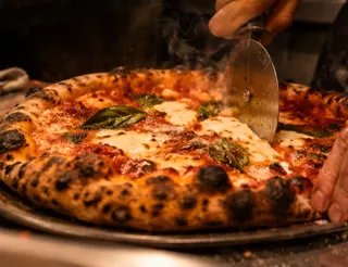
San Marzano tomato, fior di latte, basil, olive oil. Charred in the oven at 450°.

₪69Ready in 15 min
Size
Add extras
1

The app · tap a pie, pick a size, add it to the cart

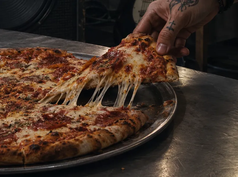
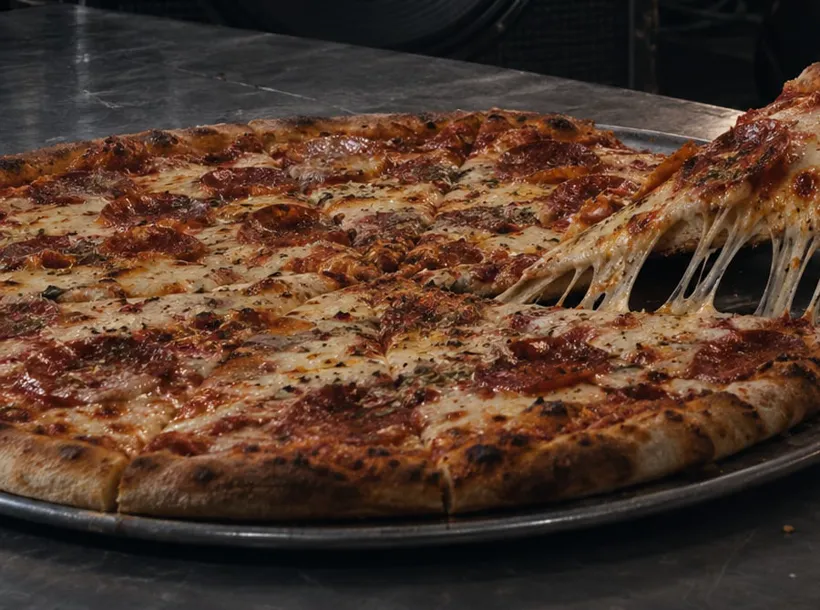
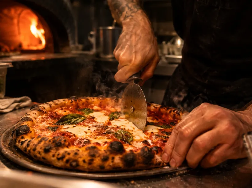
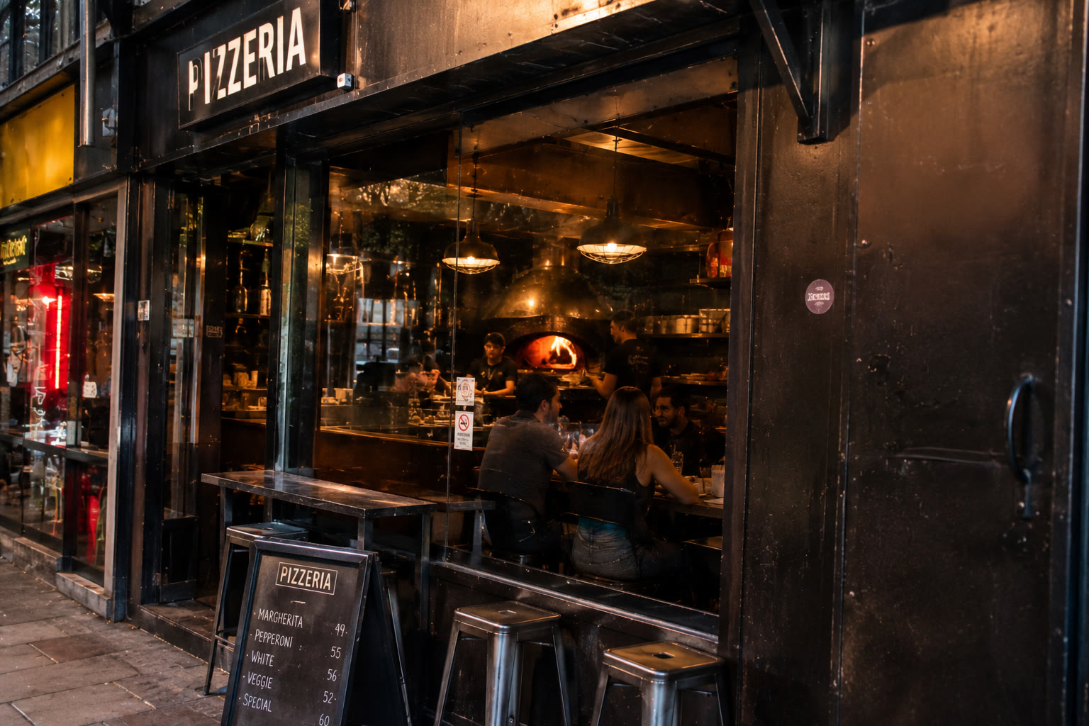
imagined content

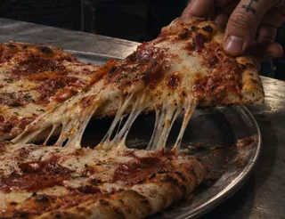
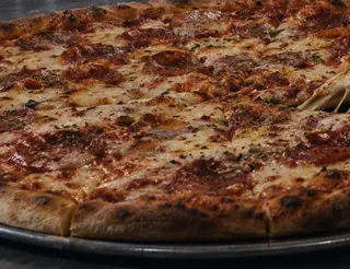
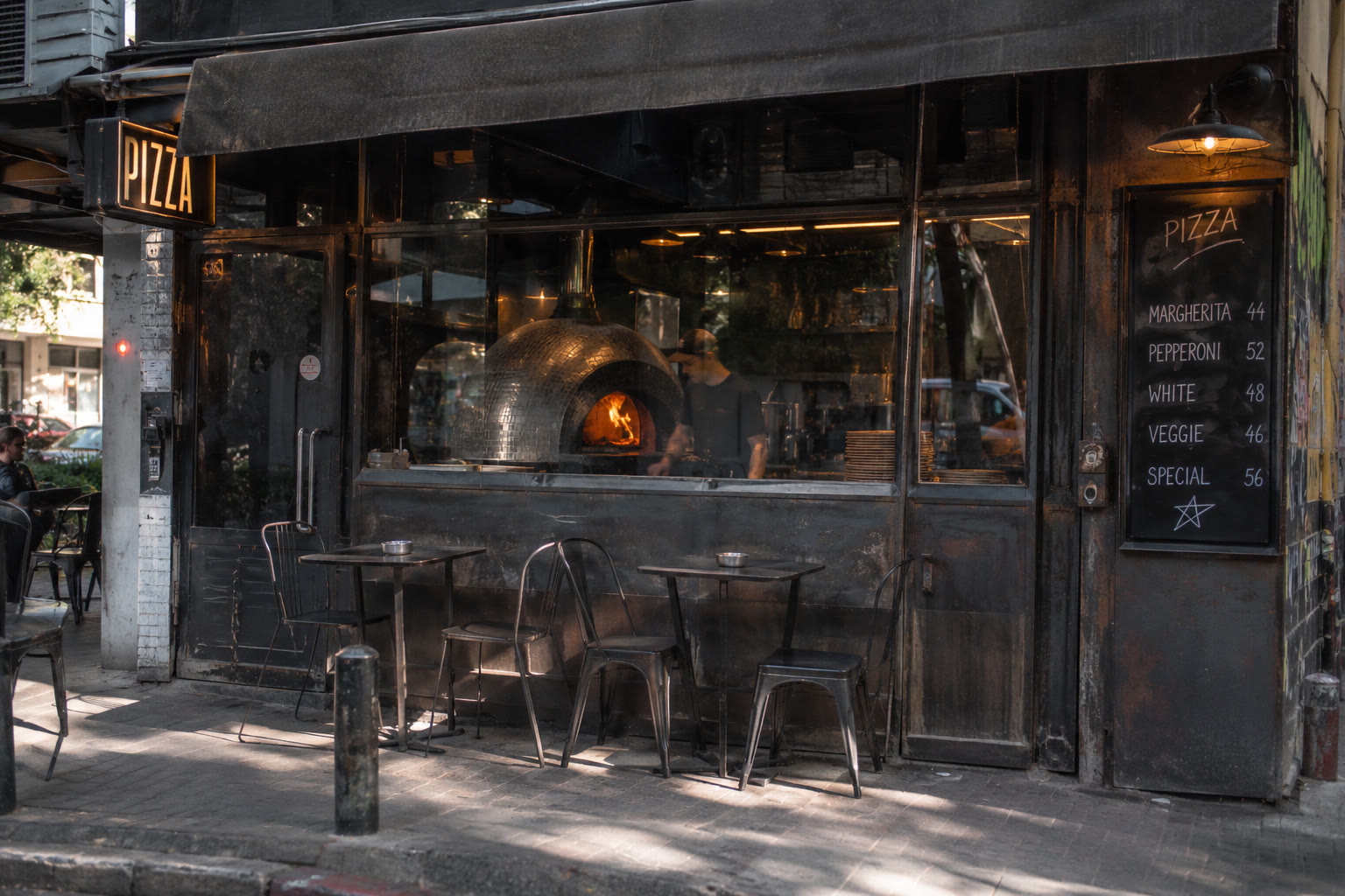
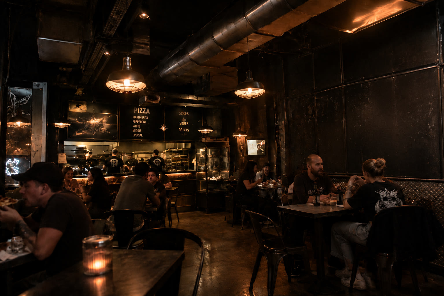
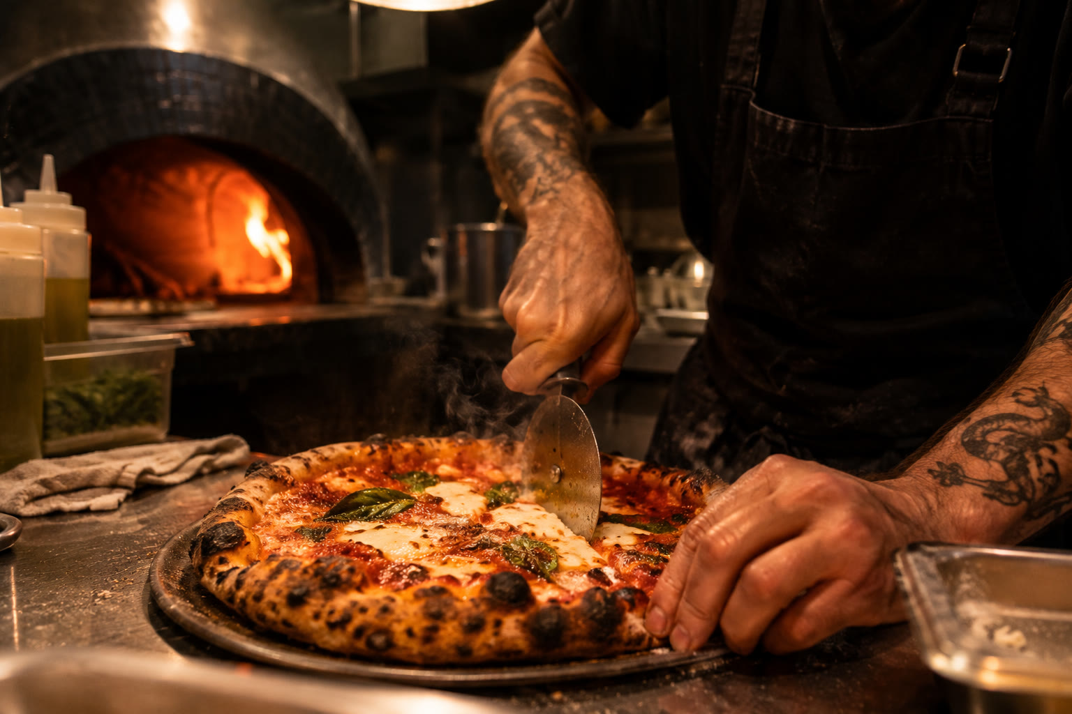
Imagined content I made with AI, to give the full picture.

the street
the room
the counter
The street, at night
The street, by day
The street, by day
Inside
Inside
At the oven
At the oven

the concept

What if a neighborhood pizza joint had the visual language of an underground metal band?

Brand DNA

Sharp, aggressive geometry.
Printed, scratched and imperfect textures.
Metal imagery treated with humor rather than seriousness.
Pizza and food imagery merged with skulls and bones.

Logo system

Primary logo
Symbol
Without the line
Small size

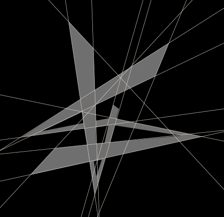
Built from its own angles

Every line is one of the mark's own edges, carried across the frame.

Elifelet logotype, with the construction lines its letterforms are built from
Logotype
Elifelet symbol, with the construction lines its letterforms are built from
Symbol
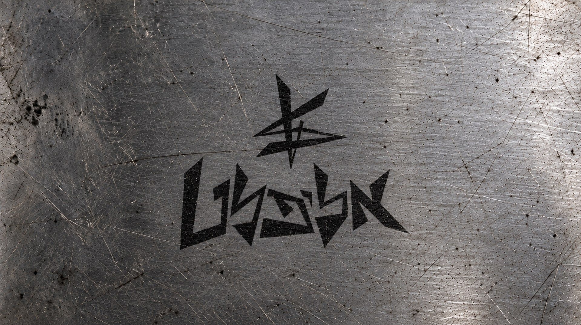
Logo on steel
Logo on steel

Brand system

  • Black
  • White
Shapes
Sharp triangles, cuts and angular geometry.
Texture
Scratches, ink, screen print and metal.
Lettering
Hand-drawn Hebrew letterforms, built from the same angles.

the process

Visual Research

From graffiti letterforms to a logo, and from the logo to a family of illustrations.

01

Research

Underground print culture, from the street to the pizza box.

The language started from underground print culture: metal typography, graffiti, punk flyers, tattoo flash, pizza packaging and screen-printed, photocopied textures. Each one became a decision:

Graffiti letterforms
02

Logo Development

Marking which angles to keep, then drawing the mark.

The logo grew out of graffiti letterforms. I marked up which angles were worth keeping and which broke the word, then drew the mark in variations.

Green for the angles worth keeping, red for the ones that broke the word
Three takes on the mark
03

Illustration Development

Skulls, pizza and a cutter.

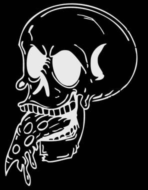
The illustrations merge anatomy, food and metal objects: a skull eating a slice, a pizza cutter that reads as a blade, a slice that turns into a skull.

Icon sketches
The three illustrations
Project
Concept, a fictional metal pizzeria
My Services
Branding
Illustration
Packaging
Mentor · School
Dekel Maimon
Shenkar
Tools
Adobe Photoshop
Adobe Illustrator
ChatGPT 2.5 - Image generation
Kling AI - Animation
Runway Gen-4.5 - Video